How can we empower people to improve their health and wellness?
Client Background
OptimumU is disrupting the wellness tech industry with their proprietary approach to measuring wellness and creating daily motivation to make healthier decisions.

Client Background
OptimumU is disrupting the wellness tech industry with their proprietary approach to measuring wellness and creating daily motivation to make healthier decisions.
We led the digital strategy and UX/UI design of the entire OptimumU platform, taking it from concept to reality. Through close collaboration we created a smartphone and smartwatch app that has a full stack of features to monitor and improve users’ health and wellness.
Before the design process could begin, we developed the vision of the OptimumU platform and prioritized the features that would be included in the initial launch of the app. To accomplish this and create the digital strategy, our team led collaborative working sessions with the OptimumU stakeholders.
The objectives of the digital strategy phase included:
- Define OptimumU’s value proposition
- Positioning the company within the health and wellness space and the direct competitors
- Create an aggressive but achievable scope and timeline for launch
- Draft the requirements for OptimumU’s user experience and design

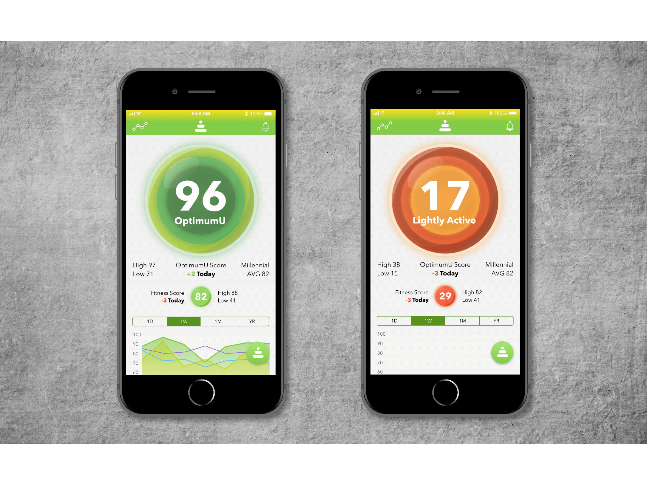
With a digital strategy in place, our team created an agile schedule that included sixteen sprints. The first sprint focused on the OptimumU score and the homescreen. The homescreen had two use cases, first, a quick glance (1-5 seconds) to check on their wellness progress, second, a detailed dive into wellness metrics and data to understand what they are doing well and what is preventing their wellness from improving.
The creation of the OptimumU score orb and placement at the top of the homescreen established a focal point for quick glances. It displayed the user’s score and changes color to based on the score. Our design hypothesis was that users would be able to quickly understand their current wellness using the orbs color. The data graphs below the orb allow users to investigate their wellness in more detail; asking their own questions and using the data to discover answers.
The entire design process was guided by the motivation to create a modern, approachable interface that enabled effortless user engagement. Our mantra of “keep it simple and make it engaging,” guided every sprint, ensuring our team remained focused and delivered an incredible product. Other features included in the app are: proactive behavior nudge notifications, workouts, tribe-based discussion forums, a gratitude journal, breathing coach, wellness challenges, menstrual tracking, wellness goals, and even a time machine.
Our work with OptimumU proved that there are unmet needs in the wellness tech space and that a new platform, built from the ground up, can meet those needs. Through close collaboration, our team was able to understand the OptimumU’s vision and embody that in a digital platform. The app is currently in a private beta and will be opening up to the public soon.


